
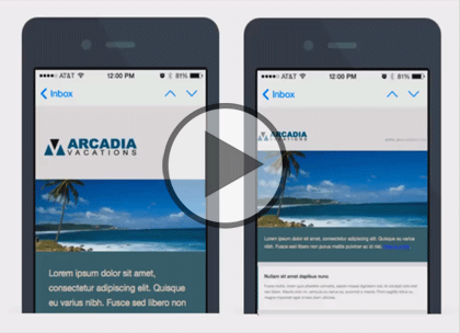
Watch trailer
Course at a glance
| Release date | 4/13/2015 | |
| Level | Beginner | |
| Runtime | 0h 59m | |
| Closed captioning | N/A | |
| Transcript | N/A | |
| eBooks / courseware | N/A | |
| Hands-on labs | N/A | |
| Sample code | N/A | |
| Exams | N/A |

Course description
In this 3 part learning series, you will learn how to design attractive, responsive emails that will look consistent across mobile devices. You’ll learn the steps and strategies needed to design, code, and optimize responsive email messages. From identifying the differences among mobile clients, to writing concise, well-position messages, this course covers it all. Learn how to design a single-column mobile friendly email, use HTML attributes with CSS, create forms and style email buttons. Discover how to target devices with media queries and enhance images for mobile displays. The course also covers how to optimize subscribe forms and plain text emails.
Prerequisites
This course assumes familiarity with HTML5 and CSS3 scripting language. This course is part of a 3 part learning series; Responsive HTML Email: Design; Responsive HTML Email: Media, Mobile & Benefits; and Responsive HTML Email: CSS, Form & Drafts. Please be sure to view the courses in order if you are new to the material.
Meet the expert

Our Creative Design courses are presented by experts from Wiley Publishing. Wiley is a global provider of knowledge and knowledge-enabled services that improve outcomes in areas of research, professional practice, and education. They are the publisher of award-winning journals, encyclopedias, books, and online products and services.
Course outline
Design
Email & Responsive Design (25:50)
- Introduction (00:10)
- Email & Responsive Design (04:28)
- Support for Responsive Design (02:42)
- Mobile First Impetus (03:22)
- Returns on Responsive Design (04:16)
- HTML Rendering issues (01:30)
- WebKit & Preprocessing (04:24)
- Media Query Support (04:46)
- Summary (00:10)
Begin HTML Responsive Design (12:37)
- Introduction (00:10)
- Code Aesthetics Responsively (02:54)
- Importance of Two CSS Layouts (03:02)
- Single Column Layout Decisions (03:40)
- Optimize UI Controls Target (02:41)
- Summary (00:10)
Mobile Email Best Practices (21:04)
- Introduction (00:10)
- Manage Fonts Responsively (03:08)
- Percentages & REMs (02:50)
- Mobile Friendly Emails (02:59)
- A Clear Call to Action (03:58)
- Hiding Unnecessary Elements (02:30)
- Wireframing (01:56)
- Wireframing Two Layouts (03:20)
- Summary (00:10)